From folds to finishes — tangible art that speaks
-
![]()
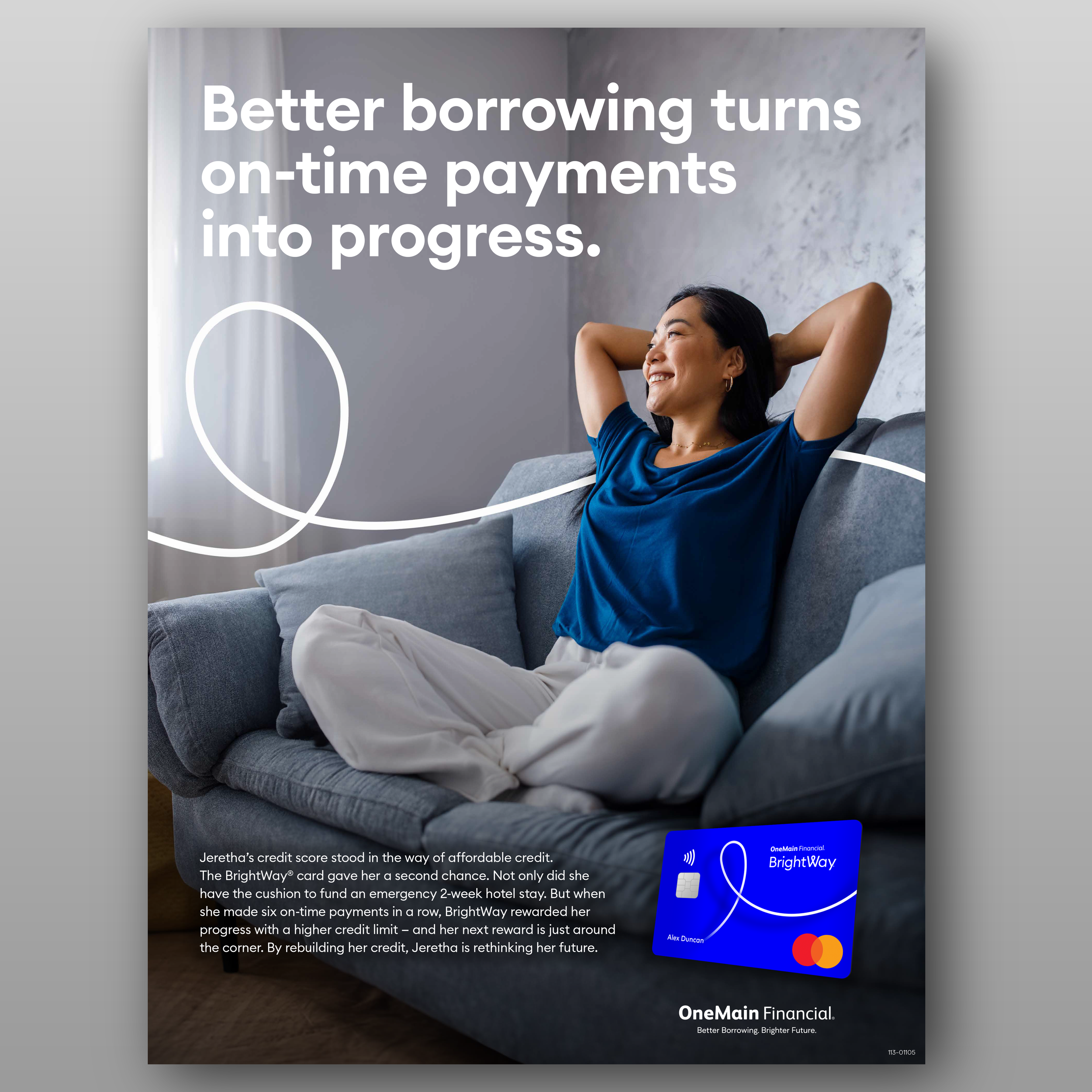
Multi product poster
Beyond highlighting product benefits, this poster serves as a pivotal touchpoint in the customer’s journey — from awareness to action. Strategically designed to resonate at the moment customers enter the branch, it introduces the Brightway Credit Card as a valuable financial tool aligned with their personal goals.
The visual narrative guides customers through the possibilities unlocked by the card, fostering an emotional connection that encourages them to explore next steps, such as speaking with a representative or downloading the app. By integrating consistent brand elements with lifestyle imagery, the design not only raises brand awareness but also supports a seamless transition through the early stages of the customer journey.
This approach positions the Brightway Credit Card as both aspirational and accessible, nurturing trust and motivating engagement that extends beyond the branch visit into long-term loyalty.
-
![]()
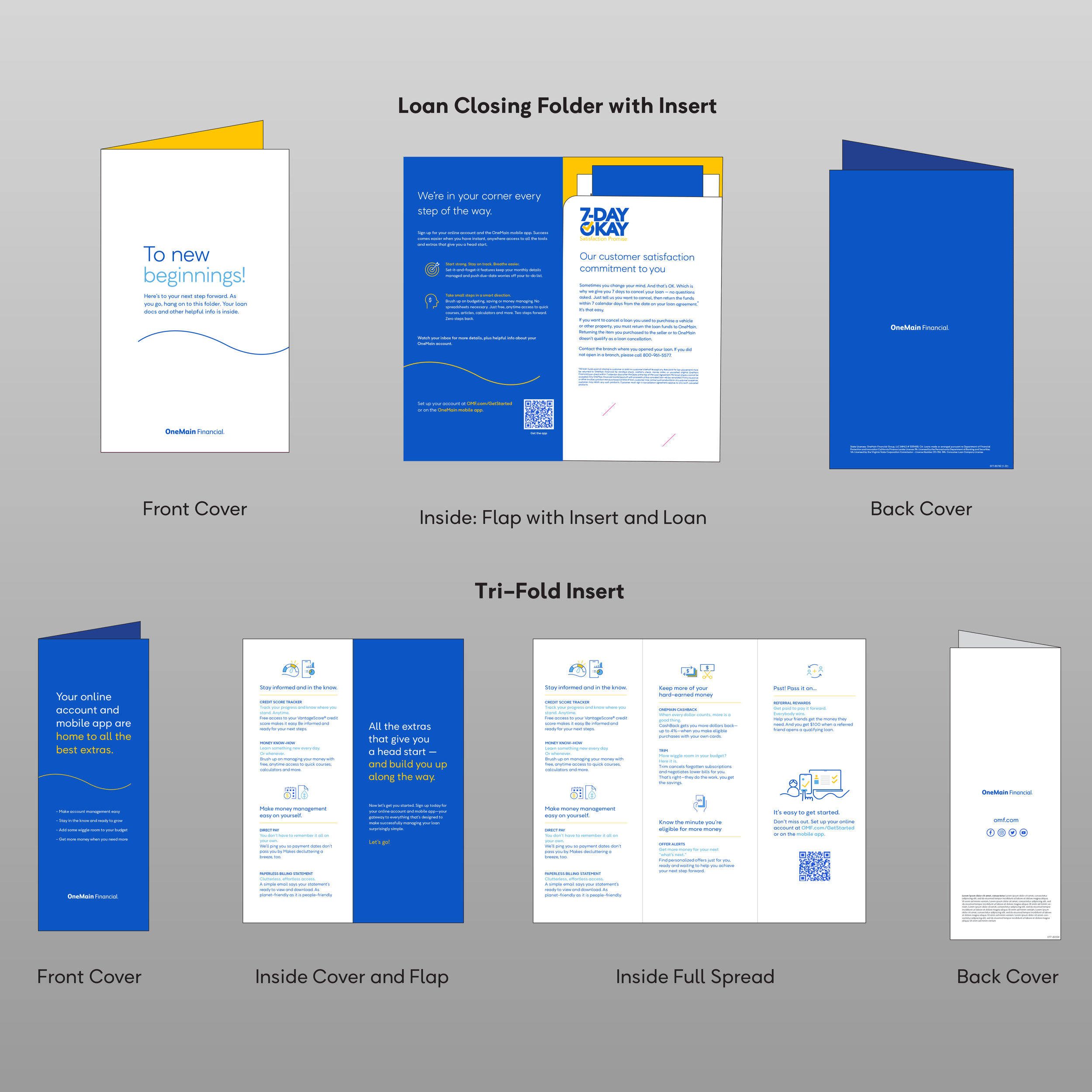
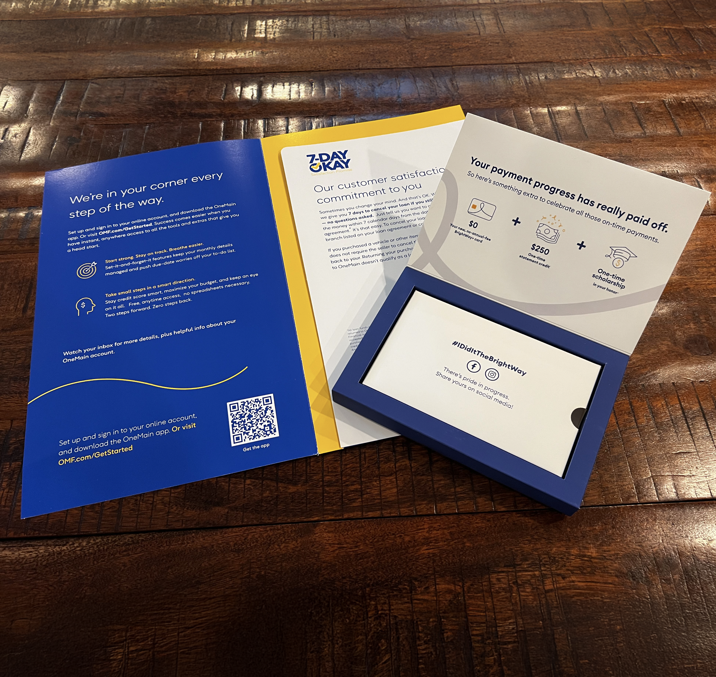
Loan close folder construct
When a customer closes on a loan, the experience doesn’t end at the branch — it continues into their home, office, and everyday life. We needed a premium print piece that would carry the brand’s voice, values, and essential information long after the transaction.
Solution
I designed a loan closing folder that serves both a functional and emotional purpose. The folder features:Custom Pocket perfectly sized for a tri-fold brochure containing step-by-step guidance.
Brand-Driven Design that reflects the trust, clarity, and optimism we want customers to feel.
Durable, Premium Stock so it holds up over time, symbolizing the reliability of the company.
Clean Content Layout ensuring the customer can quickly reference important information at any stage of their journey.
My Role as Art Director
Developed the overall concept to align with both functional needs and emotional resonance.
Selected materials, finishes, and folding structure for durability and tactile appeal.
Directed the integration of brochure design so the folder and insert work seamlessly as a system.
Oversaw prepress checks to ensure flawless color and print quality.
Customer Impact
This folder becomes more than paperwork — it’s a branded keepsake that customers carry with them, reinforcing the company’s role in their success story. -
![]()
Tangeable art
As Art Director, I produce the tools clients rely on to deliver confident, consistent experiences for every customer. (Loan folder pictured)
-
![]()
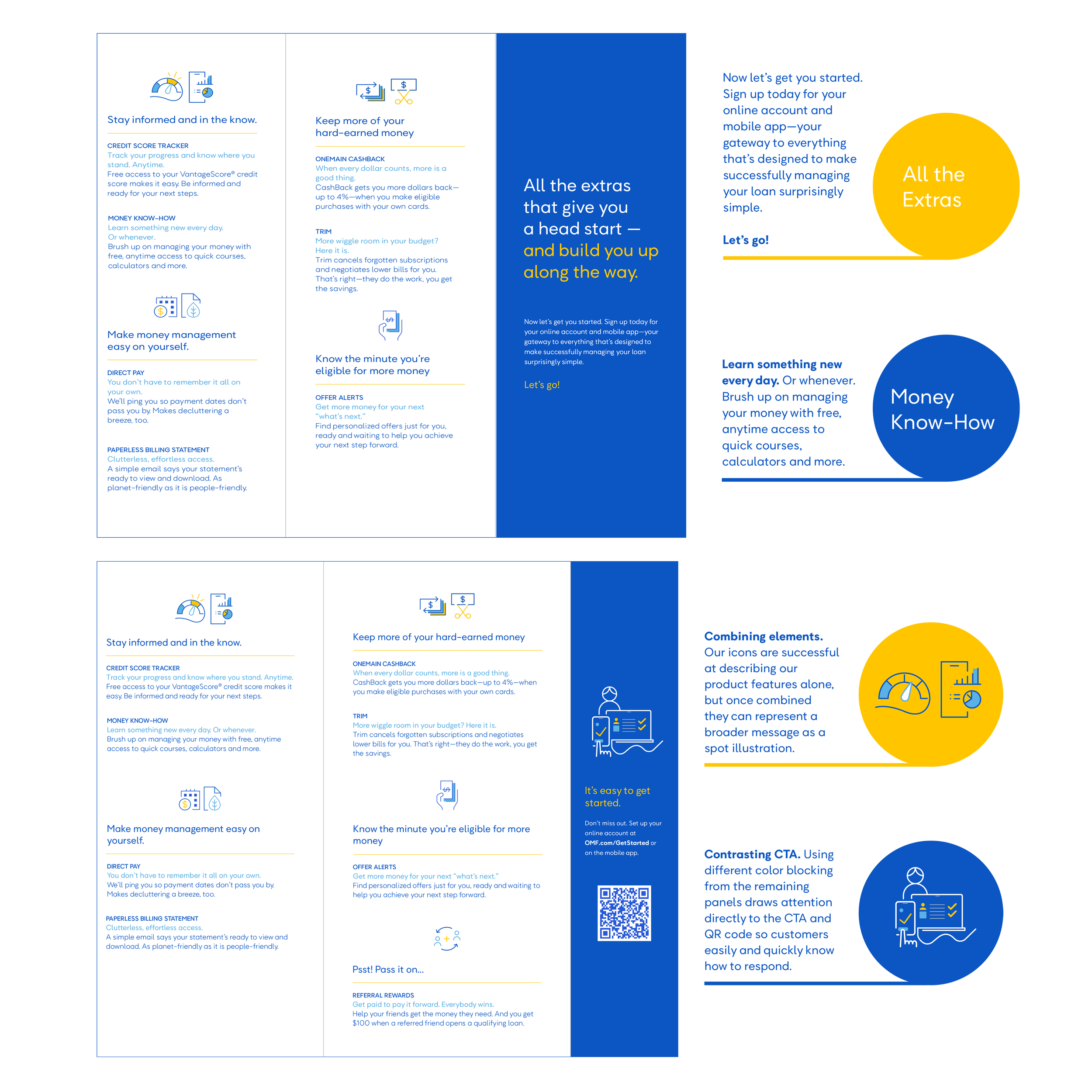
Bi fold
Purpose
This bi-fold brochure was designed to guide customers toward adopting our digital tools — specifically downloading our mobile app — to make managing their accounts easier, faster, and more secure. The piece had to quickly educate, build trust in digital banking, and create a frictionless path from physical handout to digital action.Design Approach
Clear Call-to-Action — Bold, front-and-center prompts to “Download the App” supported by a scannable QR code.
Benefit-Driven Messaging — Concise points on why customers should go digital, supported by lifestyle imagery showing convenience in action.
Step-by-Step Visuals — Simple illustrations to walk customers through the download and login process.
Brand Consistency — Colors, typography, and tone aligned with our digital marketing for a unified customer experience.
My Role as Art Director
As Art Director, my role was critical in ensuring the brochure wasn’t just visually appealing, but strategically effective in changing customer behavior:Concepted the layout to bridge physical and digital engagement seamlessly.
Directed imagery and iconography to remove intimidation around mobile banking.
Balanced marketing language with functional clarity so customers of all tech comfort levels could take action.
Oversaw production to ensure print quality matched digital brand standards, reinforcing trust at every touchpoint.
Why It’s Important
This brochure serves as a key conversion tool — turning in-branch interactions into ongoing digital relationships. By guiding customers to our app, we increase engagement, reduce service costs, and strengthen brand loyalty through everyday digital touchpoints. -
![]()
Tri fold
Purpose
This trifold brochure was designed as a clear, step-by-step guide to lead customers through their journey with our company — from initial onboarding to ongoing engagement. The goal was to provide all essential information in a compact, portable format while ensuring every section was easy to navigate and understand.Design Approach
Logical Flow — Each panel was mapped to a distinct stage of the customer journey, creating a natural progression from front cover to final fold.
Clear Visual Hierarchy — Headlines, subheads, and supporting copy were strategically sized and positioned to draw the eye in the right order.
Iconography & Imagery — Simple, brand-aligned visuals reinforced key points without cluttering the layout.
Concise Messaging — Content was pared down to essentials, eliminating unnecessary complexity.
My Role as Art Director
As Art Director, my responsibility was to ensure the brochure didn’t just look good — it needed to work as a functional roadmap for customers:Planned and structured the hierarchy so readers could instantly find the information they needed.
Directed the balance between text, imagery, and whitespace for maximum clarity.
Chose typography and color treatments to guide the reader’s eye intuitively across the panels.
Oversaw prepress checks to ensure every fold aligned perfectly, so the reading flow wasn’t disrupted.
Why It’s Important
Proper hierarchy in a trifold brochure is critical — it turns a complex process into a clear, digestible format. When designed well, it ensures customers don’t miss key steps, builds trust in the brand, and makes the overall experience feel simple and supportive from the very first touchpoint. -
![]()
Package design
Purpose
This package was created exclusively for premier customers — a select group we wanted to recognize and reward with a truly memorable unboxing experience. The goal was to design a box that not only held its contents securely, but also conveyed prestige, appreciation, and exclusivity the moment it was received.Design Features
Soft-Touch Coating — A velvety matte finish that instantly communicates quality through touch.
Magnetic Closure — A smooth, satisfying seal that enhances the feeling of craftsmanship.
Custom Insert & Layers — Tailored compartments and structural elements to cradle each item securely and reveal them in a deliberate sequence.
Premium Brand Detailing — Foil stamping, spot UV, and brand-colored interiors for a distinctive, high-end presentation.
My Role as Art Director
Concepted the overall packaging experience from first glance to final reveal.
Selected materials and finishes to create a luxury tactile impression.
Directed dieline development and structural design to ensure precision fit and function.
Oversaw color proofing and finish samples to maintain brand consistency and quality control.
Worked closely with print vendors to ensure flawless execution on every detail.
Why It’s Important
Premium customers are among the company’s most valuable advocates. This box serves as more than just packaging — it’s a relationship touchpoint. Every design choice, from the soft-touch coating to the magnetic closure, was intentional in making recipients feel recognized, appreciated, and connected to the brand on an emotional level. -
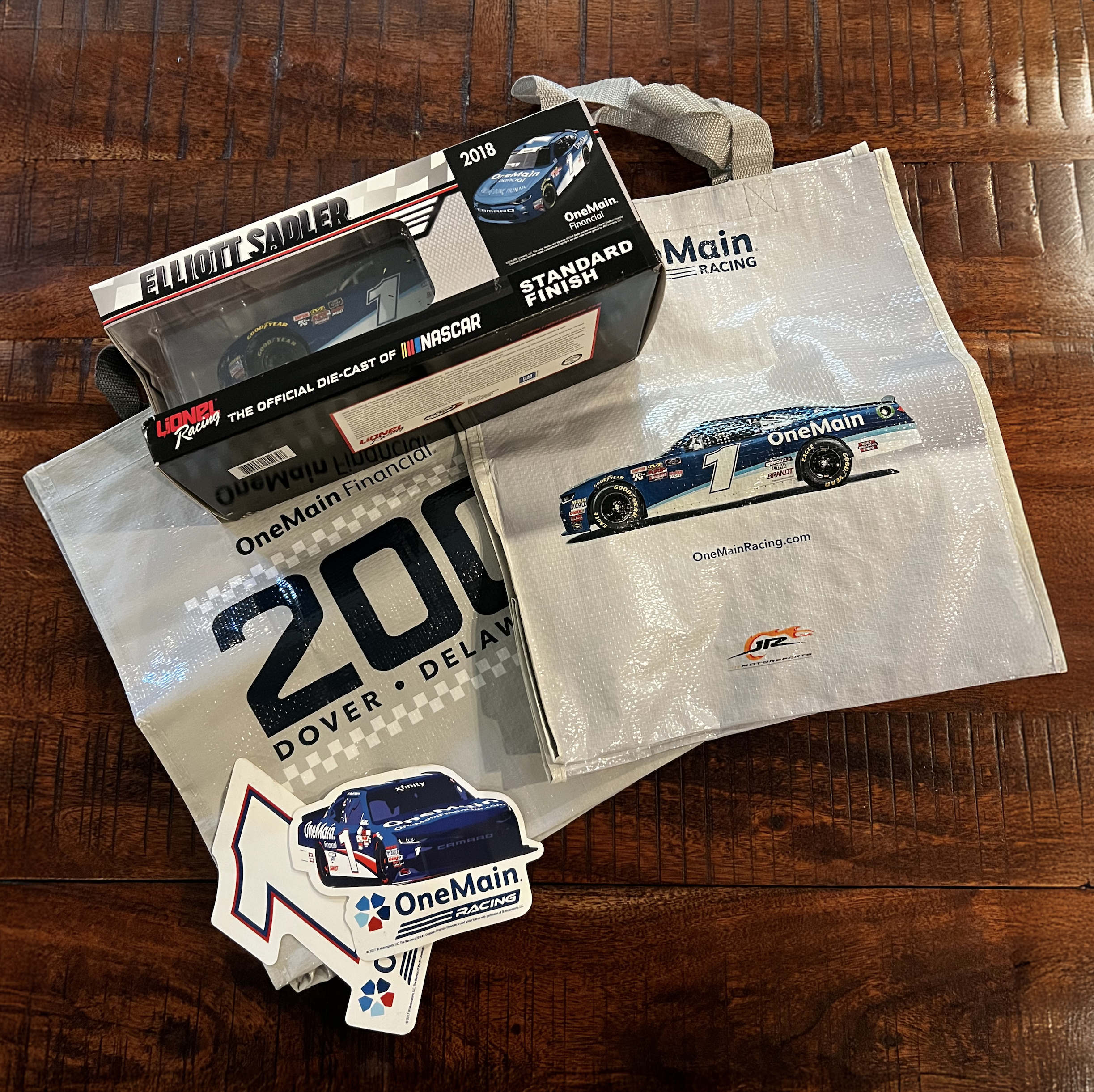
![]()
Multi-format campaign & merch production
Overview
I directed and produced a comprehensive merchandise and promotional campaign for a high-profile NASCAR title sponsorship event. This included a wide variety of deliverables across multiple formats and touchpoints:At-track billboards and large-format signage
Vehicle wraps
Swag and fan zone materials
TV spots, including bugs and promotional clips
Challenge
Managing an expansive set of assets across physical and broadcast media presented significant logistical and creative challenges, especially given the extremely tight deadlines and the need to maintain brand consistency across all executions.My Role
Designed and led the creative direction and production from concept through final delivery.
Coordinated cross-functional teams including designers, printers, sign fabricators, video editors, and broadcast partners.
Mastered a wide variety of formats and specifications — from massive track billboards to small on-screen bugs.
Maintained meticulous asset tracking and version control to ensure flawless, on-time delivery.
Communicated effectively with stakeholders to align expectations and troubleshoot in real time.
Outcome
The campaign successfully amplified the sponsor’s brand presence at the event, engaging fans both on-site and through broadcast, while showcasing my ability to manage complex, multi-channel projects under pressure without sacrificing quality or creativity. -
![]()
Billing statement inserts
Challenge
Billing statement inserts are a key communication channel for promotions and brand messaging, but the existing attachment process was manual and time-consuming, limiting design capacity and slowing production.Solution
I created a new insert format and workflow that automated the attachment process to billing statements, streamlining production while allowing for more creative flexibility. This innovation freed up valuable design time to focus on higher-impact projects without compromising quality.Design Highlights
Visually engaging promotional content aligned with brand guidelines.
Clear messaging to drive customer action.
Adaptable format to accommodate different campaigns easily.
My Role
Developed the new format with automation in mind, balancing aesthetics with production efficiency.
Led collaboration between design, print production, and fulfillment teams to implement the workflow.
Oversaw quality control to ensure elevated visuals in every insert.
Impact
The new format significantly increased design capacity, enabling faster turnaround times and enhanced visual quality — resulting in more effective promotional messaging and consistent brand reinforcement. -
![]()
Quarterly tracking cards
Purpose
Designed for high-profile C-suite board members, this business tracking card delivers quarterly company highlights at a glance. The goal was to create an infographic-driven format that transforms complex data into a visually compelling, easy-to-digest summary.Design Approach
Utilized bold, clear infographic elements to present key metrics and milestones.
Applied a clean layout prioritizing readability and quick scanning.
Incorporated brand colors and typography for consistency and professionalism.
Balanced visual interest with clarity to respect the executive audience’s time and attention.
My Role as Art Director
Conceptualized and directed the infographic style to ensure impact and accessibility.
Collaborated with data teams to translate figures into meaningful visuals.
Oversaw all design elements from sketches through final production-ready files.
Ensured the final piece was polished, on-brand, and aligned with executive communication standards.
Why It’s Important
This tracking card serves as a powerful communication tool for leadership, enabling quick, informed decisions while reinforcing the company’s narrative and performance in hand. The design distills complexity without losing nuance — a perfect blend of form and function.